
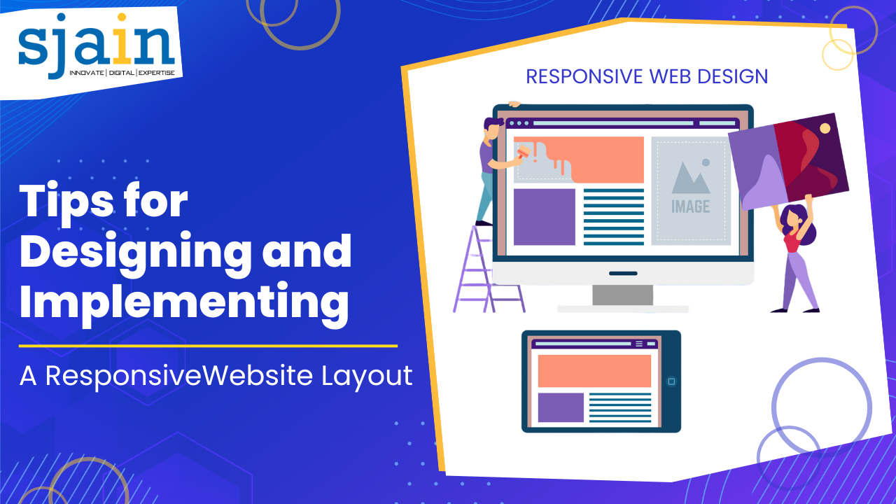
Tips for Designing and Implementing a Responsive Website Layout
In this digital world, it is crucial for businesses to have a website that is easily accessible on different devices. With an increasing number of people using mobile devices to browse the internet, having a responsive website layout has become a necessity. A responsive website design allows a website to adapt to different screen sizes, ensuring that it is easily accessible on all devices. In this article, we will discuss some tips for designing and implementing a responsive website layout that can improve the user experience and boost your website’s performance.
Understand the Concept of Responsive Design
Before designing and implementing a responsive website layout, it is essential to understand the concept of responsive design. Responsive design is a design approach that allows a website to adapt to different screen sizes and resolutions. It involves using CSS media queries to adjust the layout of the website based on the size of the screen it is being viewed on.
Start with a Mobile-First Approach
A mobile-first approach involves designing the website layout with mobile devices in mind first. This approach ensures that the website is optimized for smaller screens and that the most critical content is displayed prominently. This approach can also help reduce load times and improve the overall performance of the website.
Use a Grid System
Using a grid system can help ensure that the website layout is consistent and that the content is displayed in a structured manner. A grid system can also help with the placement of elements on the website and ensure that they are aligned correctly.
Optimize Images for Different Screen Sizes
Images can significantly impact the load times of a website, especially on mobile devices. To improve the performance of a responsive website, it is essential to optimize images for different screen sizes. This can involve using smaller image sizes for mobile devices and larger image sizes for larger screens.
Use Flexible Typography
Using flexible typography can help ensure that the text on the website is easily readable on different screen sizes. This can involve using a scalable font size that adjusts based on the size of the screen it is being viewed on.
Test the Website on Different Devices
Testing the website on different devices can help ensure that the layout is optimized for different screen sizes and resolutions. It can also help identify any issues with the website’s performance or usability.
Minimize the Use of Plugins and JavaScript
Plugins and JavaScript can significantly impact the load times of a website, especially on mobile devices. To improve the performance of a responsive website, it is essential to minimize the use of plugins and JavaScript. This can involve using native browser features and optimizing the code to reduce the file size.
Use a Content Delivery Network (CDN)
A content delivery network (CDN) can help improve the load times of a website by caching content on servers located closer to the user. This can significantly reduce the time it takes for a website to load, especially for users located far away from the website’s server.
Ensure that the Website is Accessible
Ensuring that the website is accessible to all users, including those with disabilities, is essential. This can involve using proper markup and semantic HTML, ensuring that the website is navigable using a keyboard, and providing text alternatives for non-text content.
Keep the Website Simple
Keeping the website simple can help improve the user experience and performance of a responsive website. This can involve using a minimalistic design approach and only including essential elements on the website.
Conclusion
Designing and implementing a responsive website layout can significantly improve the user experience and performance of a website. By following the tips discussed in this article, businesses can ensure that their website is easily accessible on different devices and that the user experience is enjoyable and engaging. A responsive website design can also help businesses reach a wider audience and improve their online presence.